
Recently, I was talking with a fellow interior designer about colours and she asked me what my favourite colour has been lately. I struggled to limit myself to one or two, but there are definitely some shades I turn to when putting together colour palettes for my clients. The colours I choose aren’t necessarily the latest trend. The truth is I tend to avoid a colour when it’s “playing” everywhere. After all, variety is the spice of life! These are the five colours I’ve been working with a lot lately.
1. Sorbet Orange
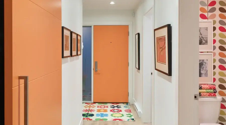
I’ve always liked bright, vivid orange, but it needs to be kept to small doses so it doesn’t become “tiring.” When I want to bring more orange into a space, I choose a colour I call “sorbet orange” (main photo), an orange whose intensity has been toned down with a little white. It’s not pastel, but it’s definitely not as intense as pure orange.
I really like this colour on furniture, whether freestanding or built-in. But it’s also an excellent choice for interior or exterior doors.
2. Teal
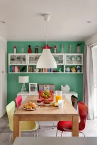 This pleasant colour is a green that has “married” a little blue, and for me, it’s the natural evolution of turquoise and lime. I still work with these mid-century modern shades, but teal (or blue-green) feels “fresher” to me because it isn’t found as often in interiors, yet!
Teal is dynamic enough to stand on its own in a space, but it also combines very well with blue, grey and cool white. A palette like this can be full of colour while still being relaxing, because the colours match each other perfectly. For greater contrast, you can pair blue-green with vivid yellows and oranges.
3. Blue-Lilac
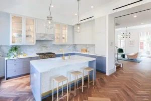
This particular lilac was always one of my favourite colours as a child. It’s certainly an unusual choice for home decor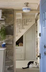 ation, but I prefer it to the commonplace pinks. It can be sophisticated or light. It works on both small and larger surfaces, especially if we opt for a lighter or greyer version of it.
Navy blue may be the trend when it comes to kitchen cabinets, and I love it too, but look how nice blue-lilac looks on the cabinets and the kitchen island. What a wonderful way to give personality and sparkle to an otherwise white kitchen!
4. Brown-Black
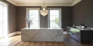 In case you think I only use light colours when decorating, this is my new favourite from the palette of dark, neutral colours. Recently, I was a big supporter of dark greys and navy, but now more and more of my clients are asking for warmer shades for their homes. Pure black would be a bit “heavy” here. Brown-black gives the space the dramatic vibe it needs while at the same time creating a warm and cosy atmosphere. If you want to paint a large surface with this colour, I’d suggest keeping the space simple and minimal. Add warm whites and keep curtains and blinds to a minimum so the room floods with natural light.
5. Golden Green
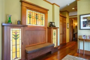 Shades of leaf and lime were my favourites for quite a while. My car is lime-coloured! Of course, lately I’ve started to like the lighter, “cooler” versions of it. I call them golden green because they have a yellow, sunbeam-like tinge in them. They look so fresh, and in lighter tones you could even call them neutral.
As with sorbet orange, golden green suits many different styles and many spaces, from a classic wooden piece of furniture in a hallway to a modern bathroom.
source: https://www.houzz.com/